While looking for a trend in long-term NINO3.4 Data, I created a running total of the data, where the value of each subsequent year was added to the prior year total, as illustrated in the following table and graph.
Year ...... NINO3.4 (deg C) ...... NINO3.4 Running Total
1871 .......... -0.42267....................... -0.42267
1872 .......... -0.76575....................... -1.18842
1873 .......... -0.76925....................... -1.95767
1874 .......... -1.2345.......................... -3.19217
 Figure 1
http://i28.tinypic.com/1zv4vpt.jpg
There was no mistaking the shape of the curve, but the scale was wrong. So I added only a percentage of each NINO3.4 reading to the previous total, finally settling on 6.8%.
The following graph is the “NINO3.4 Running Total with a 6.8% Coefficient” compared to the global temperature anomaly (HADCrut3GL).

Figure 2
http://i31.tinypic.com/14rzb8.jpg
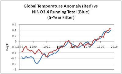 Figure 3
The divergence prior to 1909 is easily attributable to data errors in sampling and calculating global temperature and NINO3.4. In fact, in the following reference and data source, the authors state, “Because the number of observations in the tropical Pacific drops greatly prior to about 1950, the quality of the analyses is not as good as in recent years and structures of SST anomalies are partially imposed by the method of analysis, which used empirical orthogonal functions as a means of spatial interpolation. Data are very sparse in the Pacific prior to the opening of the Panama Canal in 1914, and many months do not contain any observations in the N3.4 or Niño 4 regions.”
The smoothed and normalized El Niño Reconstruction is from “Indices of El Niño Evolution” (2001), Kevin E. Trenberth, and David P. Stepaniak J. Climate, 14, 1697-1701.
http://www.cgd.ucar.edu/cas/papers/jclim2001b/ENflavorsr.html
http://www.cgd.ucar.edu/cas/catalog/climind/TNI_N34/index.html#Sec5
Updated raw NINO3.4 data attached to the second link:
http://www.cdc.noaa.gov/Pressure/Timeseries/Data/nino34.long.data
BACK TO THE CUMULATIVE EFFECT
Why would a running total of ENSO data correlate to global temperature anomaly? It appears that the atmospheric and SST heat gain (or loss) from each El Niño (or La Niña) impacts global temperature directly and then mixes and decays while the Rossby waves travel throughout the oceans over the following years, continuing their effect on atmospheric temperatures but to a lesser degree. This would require a longer decay rate than normally calculated by GCMs.
In a controversial paper, “Decade-scale trans-Pacific propagation and warming effects of an El Niño anomaly”, (1994) Jacobs et al identified decade-long residual effects of the 1982-83 El Niño.
The abstract:
“El Niño events in the Pacific Ocean can have significant local effects lasting up to two years. For example the 1982-83 El Niño caused increases in the sea-surface height and temperature at the coasts of Ecuador and Peru1, with important consequences for fish populations2,3 and local rainfall4. But it has been believed that the long-range effects of El Nino events are restricted to changes transmitted through the atmosphere, for example causing precipitation anomalies over the Sahel5. Here we present evidence from modeling and observations that planetary-scale oceanic waves, generated by reflection of equatorial shallow-water waves from the American coasts during the 1982–H83 El Niño, have crossed the North Pacific and a decade later caused northward re-routing of the Kuroshio Extension—a strong current that normally advects large amounts of heat from the southern coast of Japan eastwards into the mid-latitude Pacific. This has led to significant increases in sea surface temperature at high latitudes in the northwestern Pacific, of the same amplitude and with the same spatial extent as those seen in the tropics during important El Niño events. These changes may have influenced weather patterns over the North American continent during the past decade, and demonstrate that the oceanic effects of El Niño events can be extremely long-lived.”
Note that in 1994 the Pacific Decadal Oscillation (PDO) had yet to be identified. Though the above description bears a similarity to the PDO, the source of the PDO is still controversial. Do higher frequencies of El Niños (La Niñas) produce a positive (negative) PDO, or does a positive (negative) PDO trigger a higher frequency of El Niños (La Niñas)? Regardless, El Niños/La Niñas appear to have a longer effect on climate than climate models predict--or a longer effect than modelers share in their reports.
Is the divergence of high-latitude Northern Hemisphere temperature in the following graph an example of the long-term effect of the 1997/98 El Niño? We’ve been told that GCM-predicted polar amplification results from greenhouse gas emissions, but the amplification from 2000 to present seems to stem from the 1997/98 El Niño, not from anthropogenic sources, which should be gradual.
 Figure 4
http://i29.tinypic.com/jfb6og.jpg

Figure 5
http://i30.tinypic.com/27xov8z.jpg

Figure 6
http://i25.tinypic.com/2e6gggx.jpg

2 comments:
From Warwick Hughes
Bob, Your Nino3.4 calculations and correlation with HADCrut3(land and sea) is interesting indeed.
[1] I think it is important to remember the history of SST compilations, I have scanned Figures from a 1984 paper;
http://www.warwickhughes.com/sst/
showing the massive adjustments required to smooth out huge discontinuities around WWII. Adjustments much larger than the trend.
[2] Note how the bottom graphic shows little trend over the 1860-1980 period. You would find much more warming in a modern dataset, HadSST2 say.
[3] Then from the time in late 1980's when GW became a global issue with the IPCC in charge, Jones and others corrected SST's to fit UHI affected land data.
There is a great paper in this for someone with access to old versions of SST data.
To what extent adjustments have impacted Nino3.4 I can not say but you should maybe keep in mind that Nino3.4 calculated as you have, agrees with HadCRUT3 because SST's including Nino3.4 data have been adjusted years ago to be more congruent with CRU land data.
Could this be part of the explanation for the correlation you find ?
Warwick: I understand your concerns about the adjustments to SST. Without those changes over the years, the rise in SST and global temperature anomaly would be much reduced. Similarly, without adjustments, trends in U.S. mainland temperatures are negative over the 20th century.
However, keep in mind a few things about what I've done here. I've taken a noisy central equatorial Pacific SST anomaly, and by adding a constant small percentage of each reading to the prior sum, I've produced a curve that mimics a global temperature anomaly curve. It works with Hadley Centre, GISS, or NCDC data. It's the shape of the curve, not the slope, that's important, since I can change the slope with a different coefficient. The post I'm working on now uses two other sources of ENSO data, with the same outcome. In a subsequent post, I'll use GISS and NCDC for reference temperatures.
Regards
Post a Comment